aether
The Skincare Atelier
Sector: Luxury lifestyle (concept)
Scope: Brand strategy · Visual identity · Brand system · Packaging & digital direction
OVERVIEW
AETHER is a conceptual luxury skincare brand built to test a single idea: in a premium category saturated with spectacle, restraint can be the differentiator. The project explores how a system-led identity—quiet, disciplined, and repeatable—can create credibility without relying on trend, ornament, or performative luxury. The result is a brand foundation designed to hold across packaging, product communication, and digital commerce with the same measured clarity.
THE CHALLENGE
Luxury skincare rarely competes on substance alone—it competes on noise. The category is crowded with exaggerated promises, visual overload, and aesthetic churn. The challenge was to design a brand that felt composed and inevitable: premium without theatrics, clear without coldness, and distinctive without decoration. AETHER needed to signal confidence through structure, not persuasion.
POINT OF VIEW
In luxury, consistency is more persuasive than novelty. AETHER is designed to recede rather than compete—allowing proportion, material, and language to carry meaning. The identity prioritizes calm authority: a system that doesn’t ask for attention, but earns trust through repetition and control.
STRATEGY
Prioritize restraint over expression
Build a flexible system rather than a fixed aesthetic
Design for longevity across physical and digital applications
Every decision was measured against one question: “Does this still feel inevitable five years from now?”
BRAND SYSTEMS
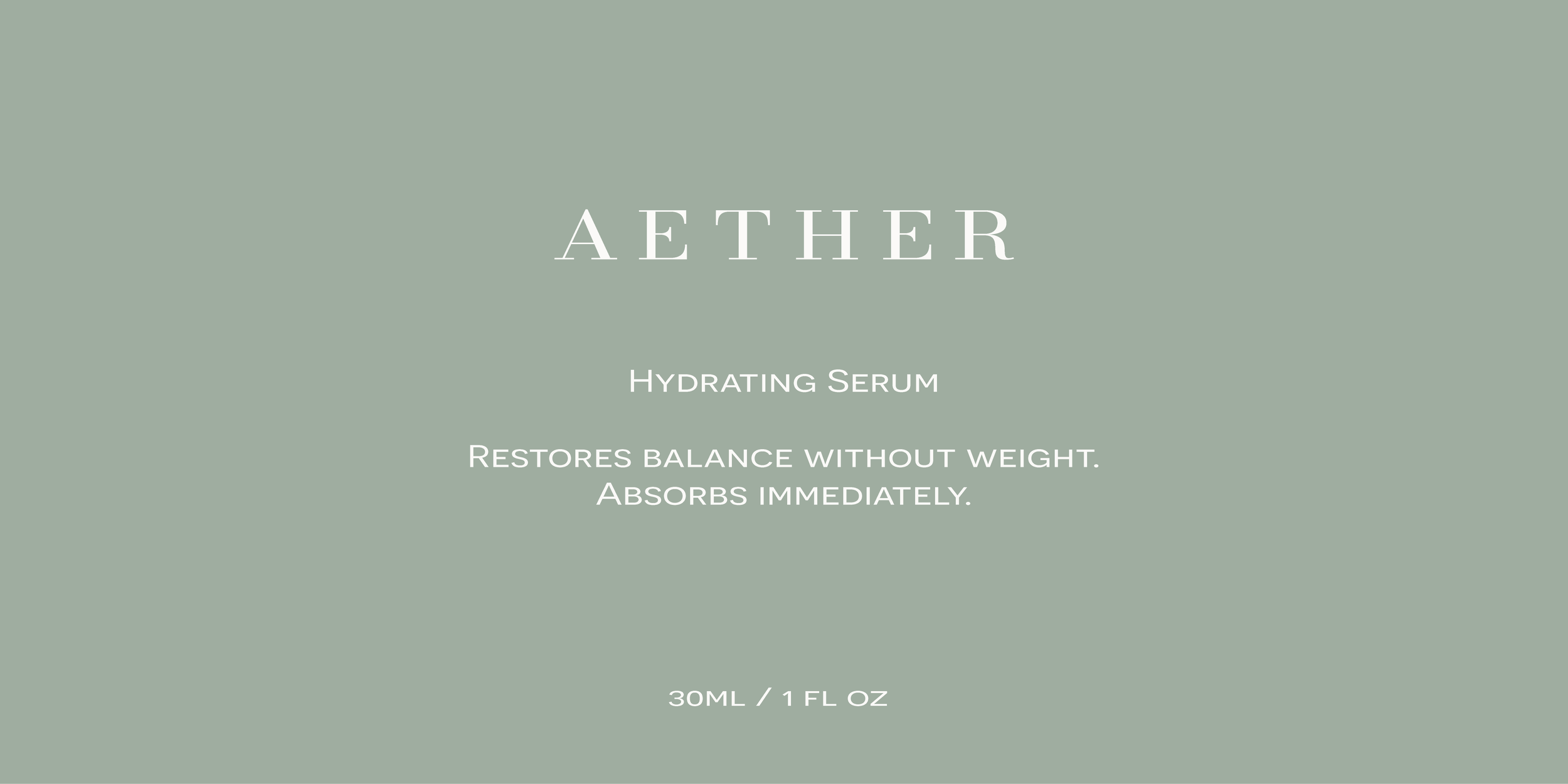
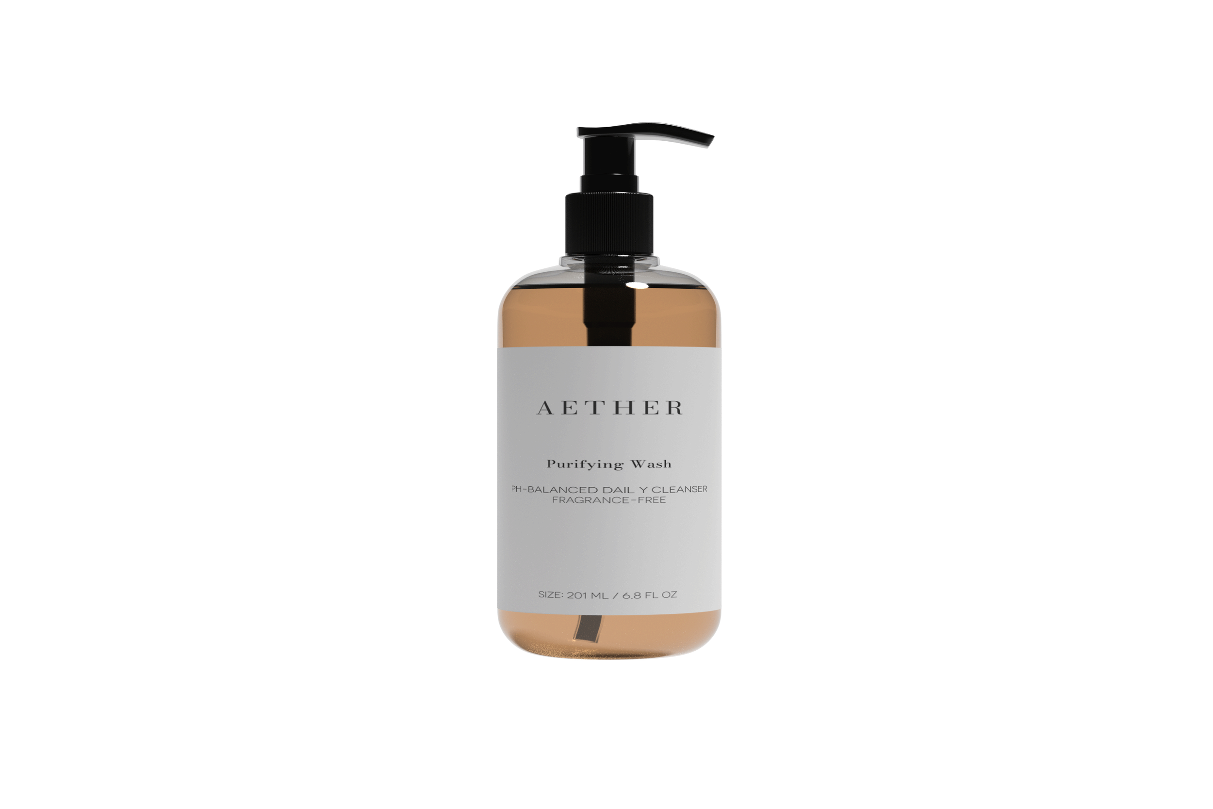
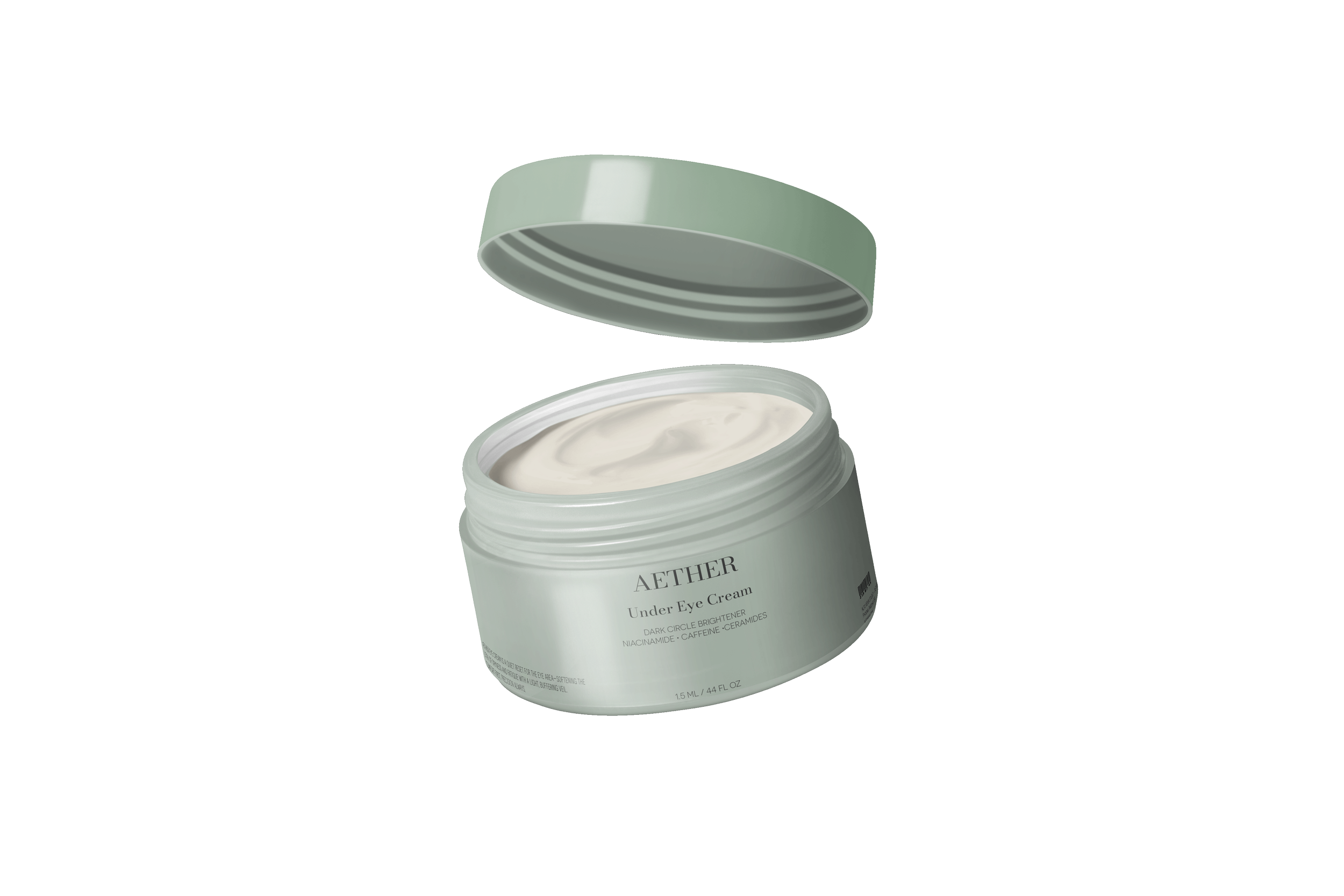
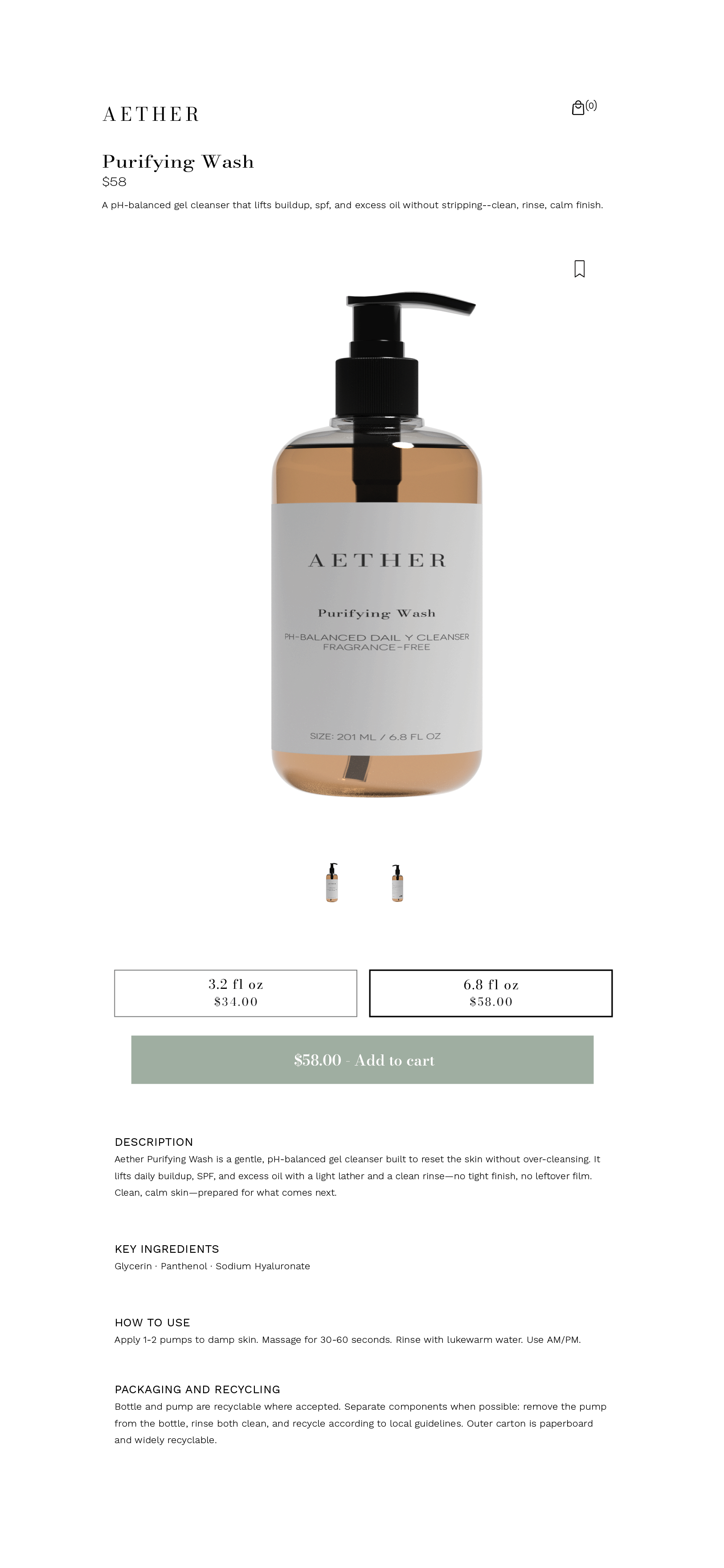
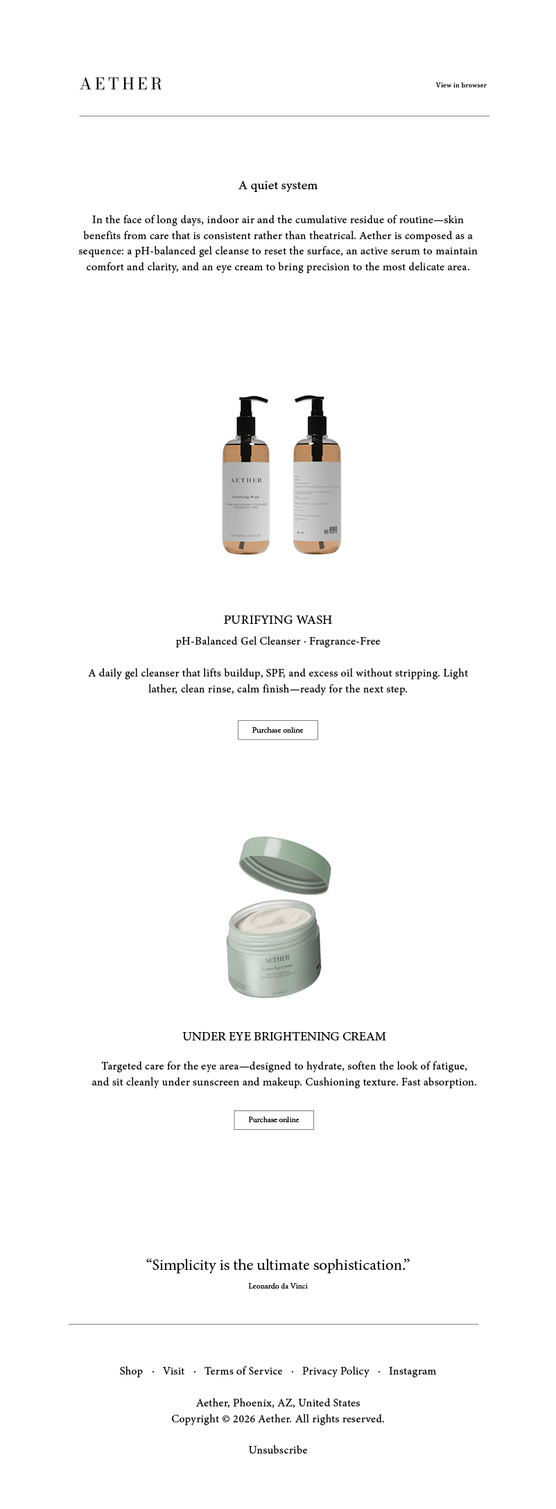
Packaging Hierarchy - A structured labeling approach establishes order through spacing, typographic contrast, and restraint. Information is prioritized to read cleanly at a glance, while the overall composition remains quiet and composed.
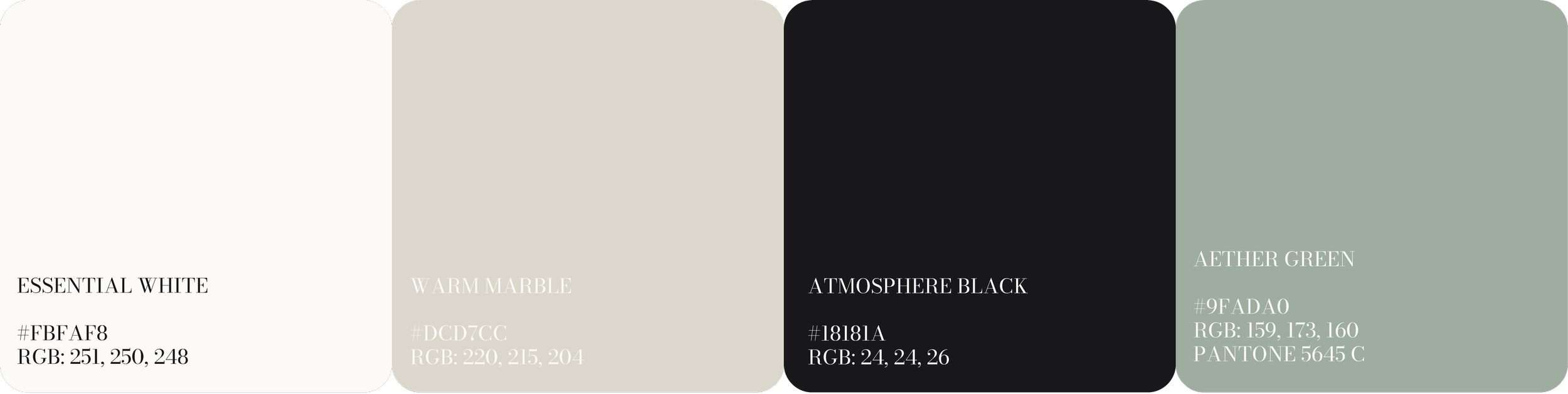
Color - A mineral-inspired palette was developed to support photography and material texture rather than compete with it. Color operates structurally—creating contrast, order, and depth—while preserving the brand’s quiet tone.
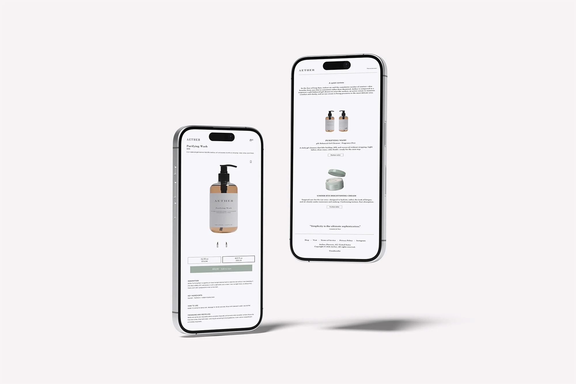
Digital Direction - Digital touchpoints were designed as an extension of the physical system: generous whitespace, strict hierarchy, and minimal interface cues. The product detail page and email layout emphasize clarity and repetition, presenting product information in a calm, modular format.
APPLICATIONS
The system was applied across key touchpoints to ensure coherence:
• Primary packaging (bottles, jars)
• Product labeling and hierarchy
• Packaging mockups and editorial product composition
• Digital commerce components (PDP + email)
Each application reinforces consistency, spacing, and restraint—allowing the brand to feel unified without feeling rigid.
OUTCOME
The resulting work positions AETHER as a calm, credible presence within the luxury skincare space—communicating confidence through clarity and repetition rather than noise.
This project demonstrates how system-led design can create premium perception and durability, even in concept form.